EuroBronze Rebrand & Studio Experience Design
Overview
EuroBronze had already built an enviable business: two Washington, DC studios, a loyal client base, strong word of mouth, and an exceptional Net Promoter Score of 84. Clients trusted the team to deliver natural, long-lasting tans tailored to their skin tone, event, and timeline.
But the brand surrounding that service hadn’t kept pace.
The website and booking experience felt overwhelming. The studios lacked a consistent visual identity. Competitors with less expertise were beginning to look more modern and polished. And although clients were paying for EuroBronze’s knowledge, customization, and care, the brand was still relying on familiar “luxury” and wellness language that didn’t fully explain why the experience was worth a premium.
Bridget partnered with EuroBronze on a comprehensive rebrand designed to close that gap—not simply by creating a new logo, but by rethinking how the business positioned itself, communicated its value, served its clients, and showed up across every studio.
Scope of Work
Client research and survey development
Staff interviews and secret shopping
Studio tours and observational analysis
Competitive and white-space analysis
SWOT and operational recommendations
Client persona development
Brand positioning and architecture
Unique value proposition and messaging
Brand pillars and tone of voice
Customer journey and lifecycle strategy
Loyalty and membership concept development
Visual identity and logo refinement
Color, typography, pattern, and imagery systems
Studio experience and interior design guidelines
Retail, merchandising, and product strategy
The Strategy
Research revealed that EuroBronze’s greatest strength wasn’t traditional luxury. Clients weren’t coming for a velvet-rope spa experience or vague promises of indulgence. They came because the technicians knew what they were doing, genuinely listened, customized every formula, and made them feel comfortable throughout a service that can otherwise feel intimidating.
That created a clear opportunity: reposition EuroBronze as the professional yet approachable expert in a category crowded with mass-market tanning chains on one side and highly aesthetic wellness brands on the other.
The new positioning centers on a simple truth: EuroBronze delivers expert-applied spray tans, customized for your tone and your timeline—because there’s no such thing as one-tan-fits-all.
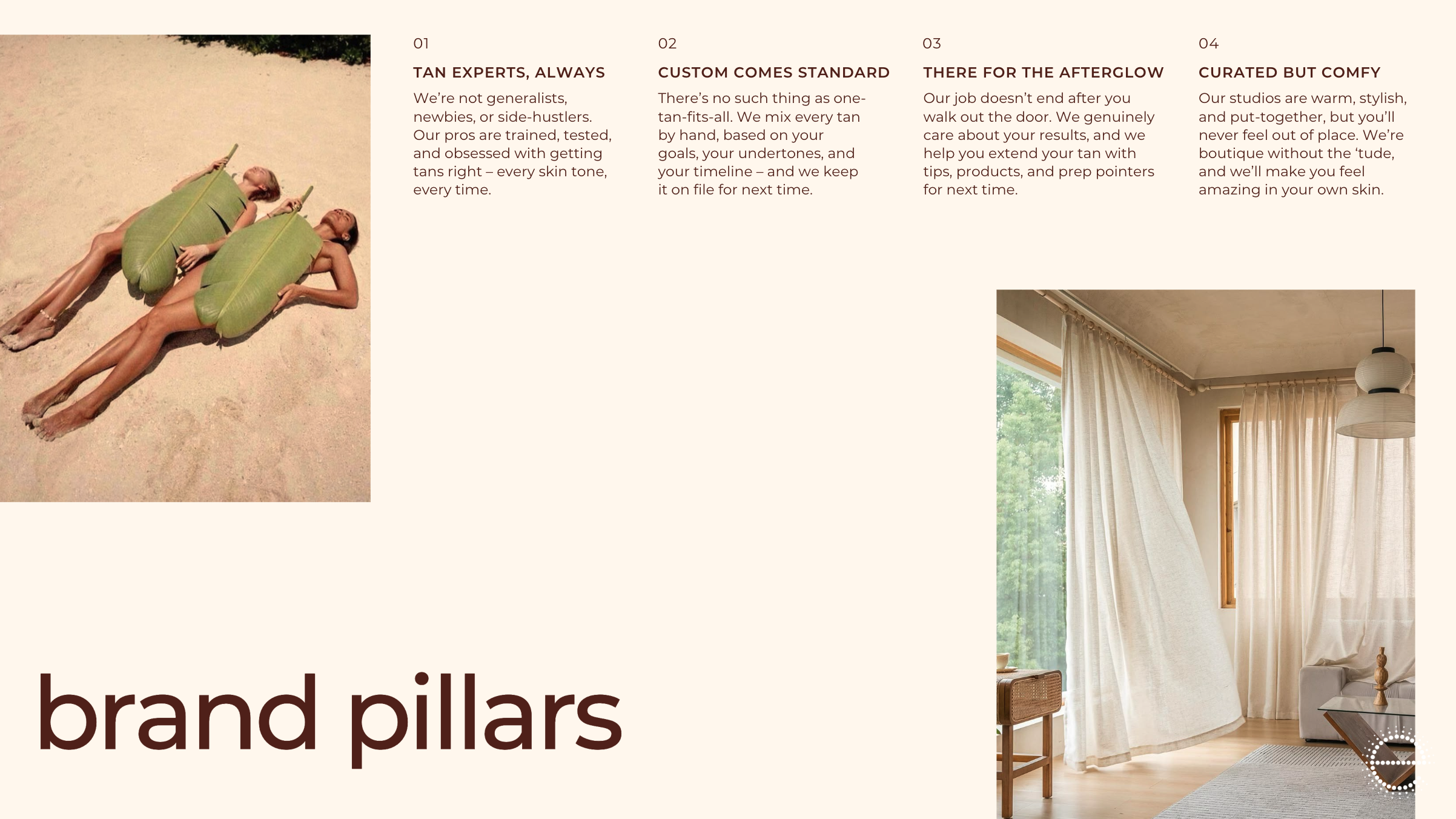
Four brand pillars brought that positioning to life:
Tan Experts, Always
Custom Comes Standard
There for the Afterglow
Curated but Comfy
Together, they gave the company a framework for making decisions across marketing, training, service, retail, studio design, and future expansion.
The Brand
The new identity needed to feel elevated without becoming sterile, precious, or unapproachable.
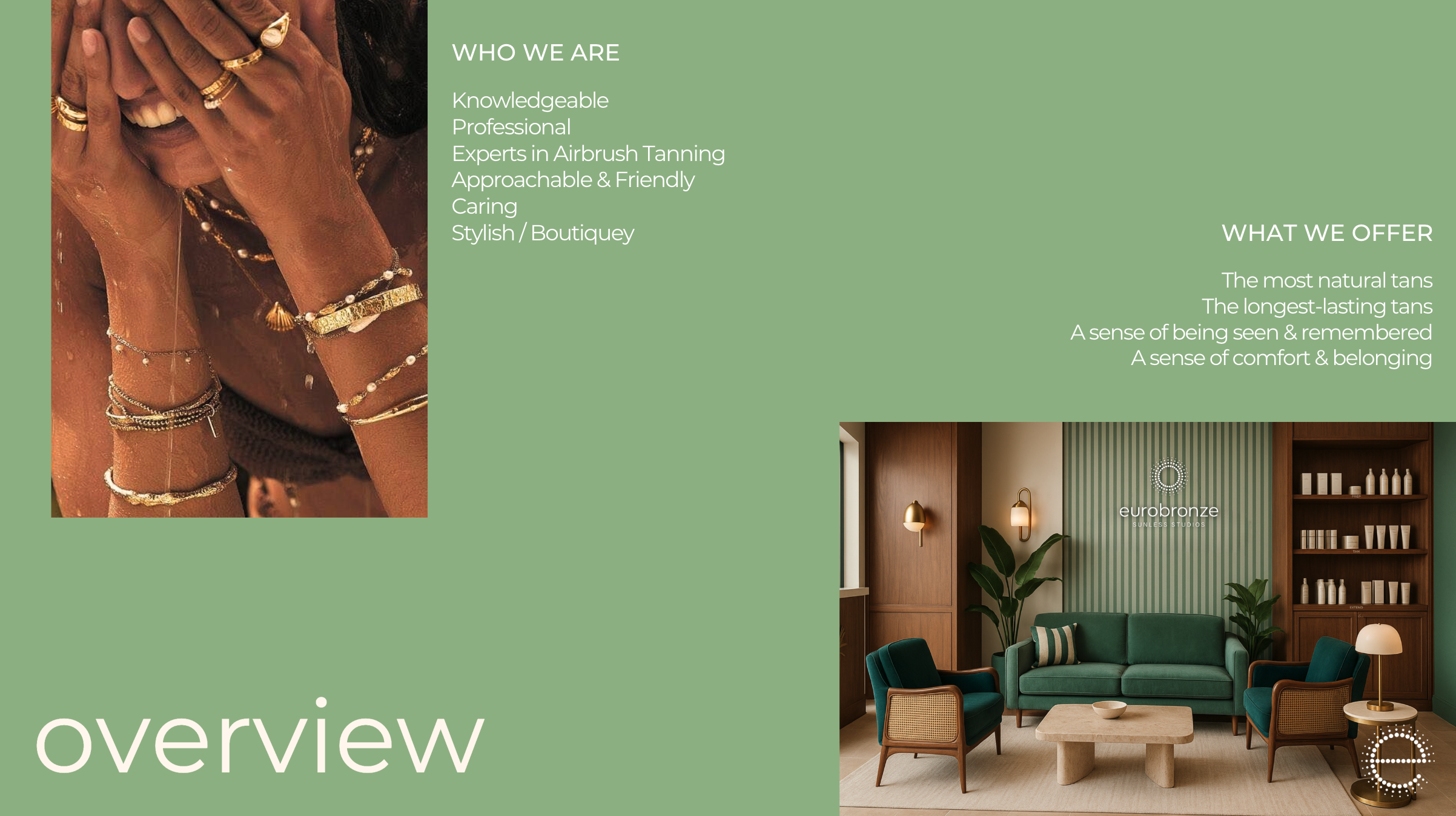
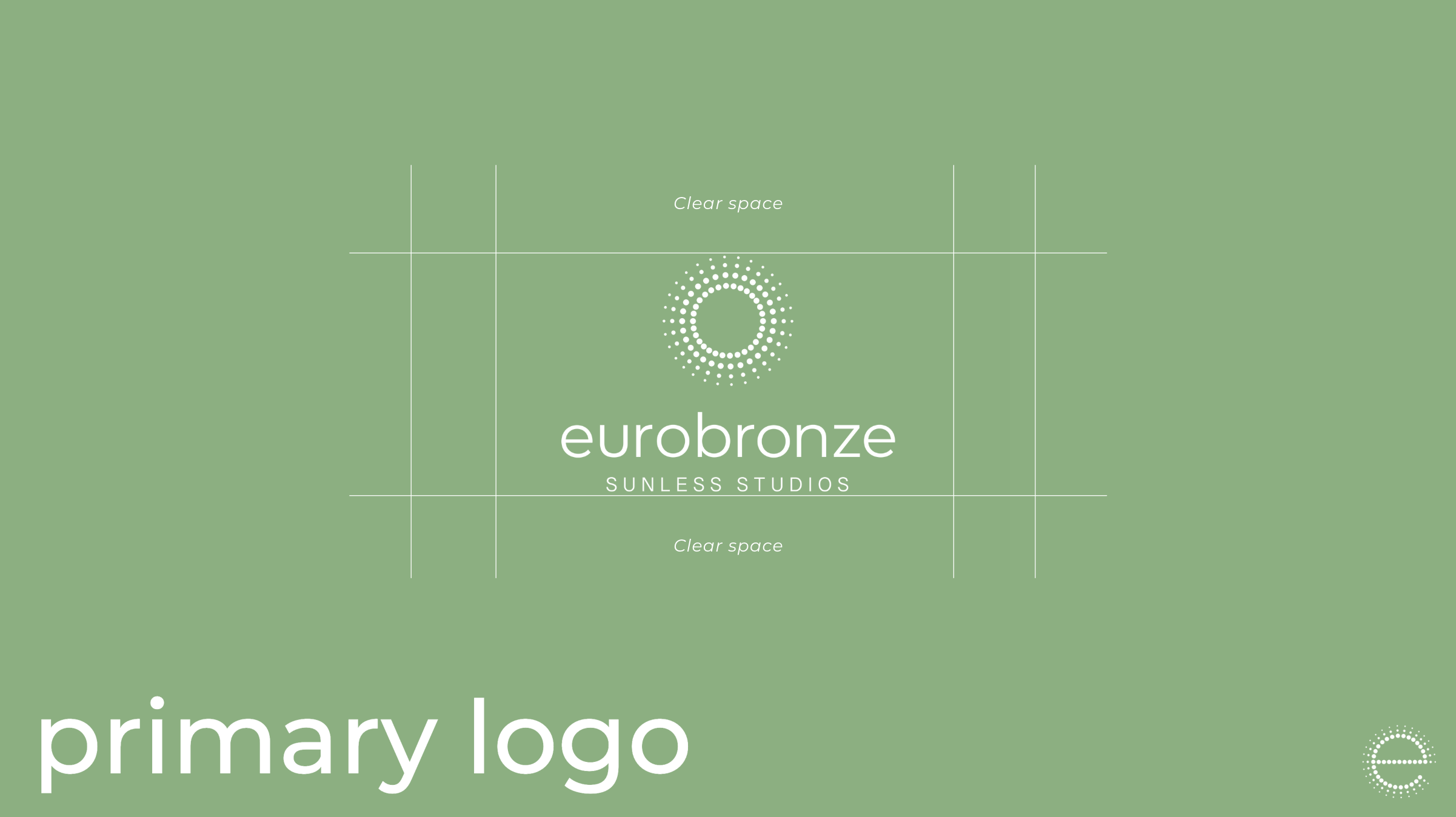
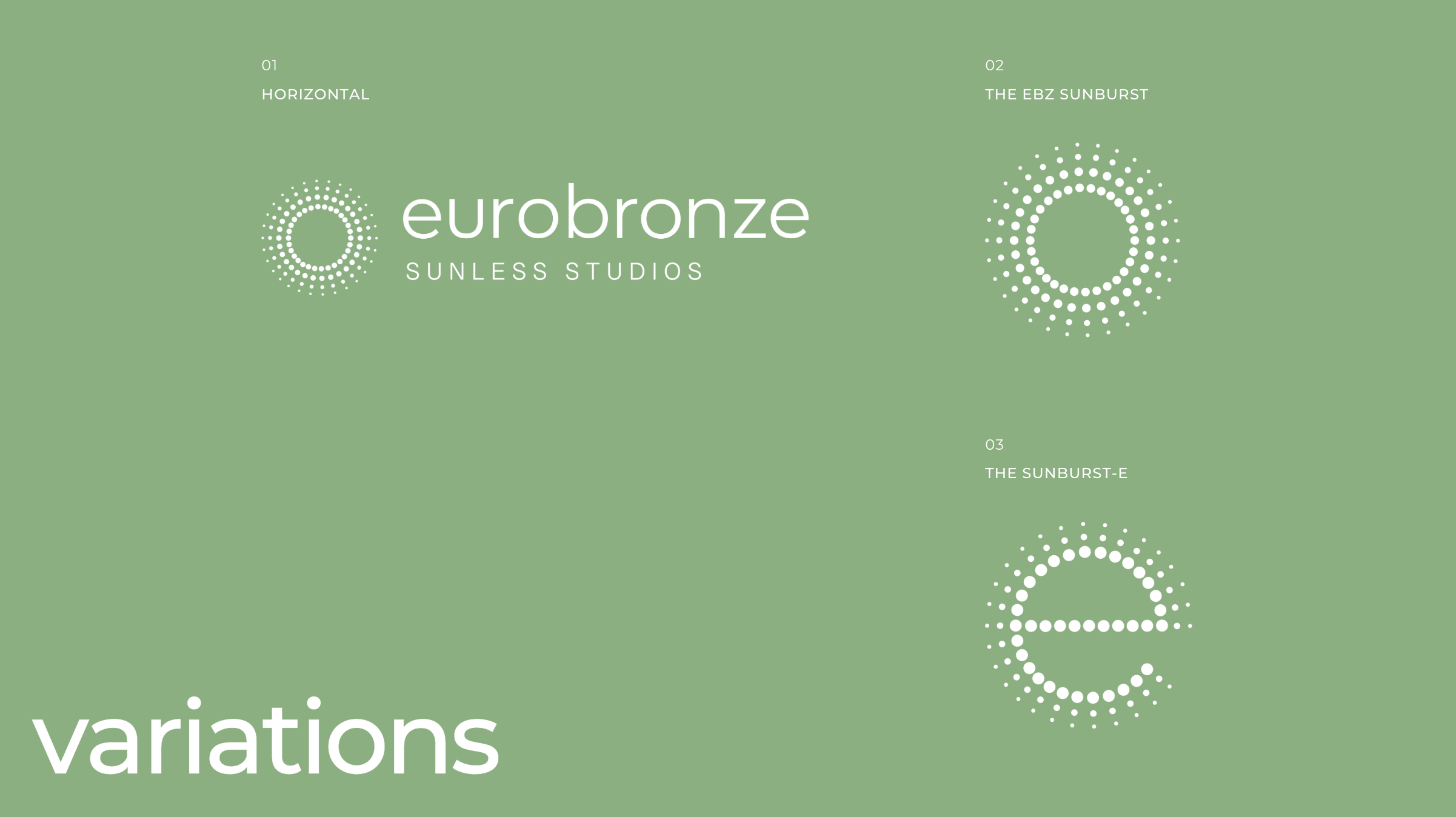
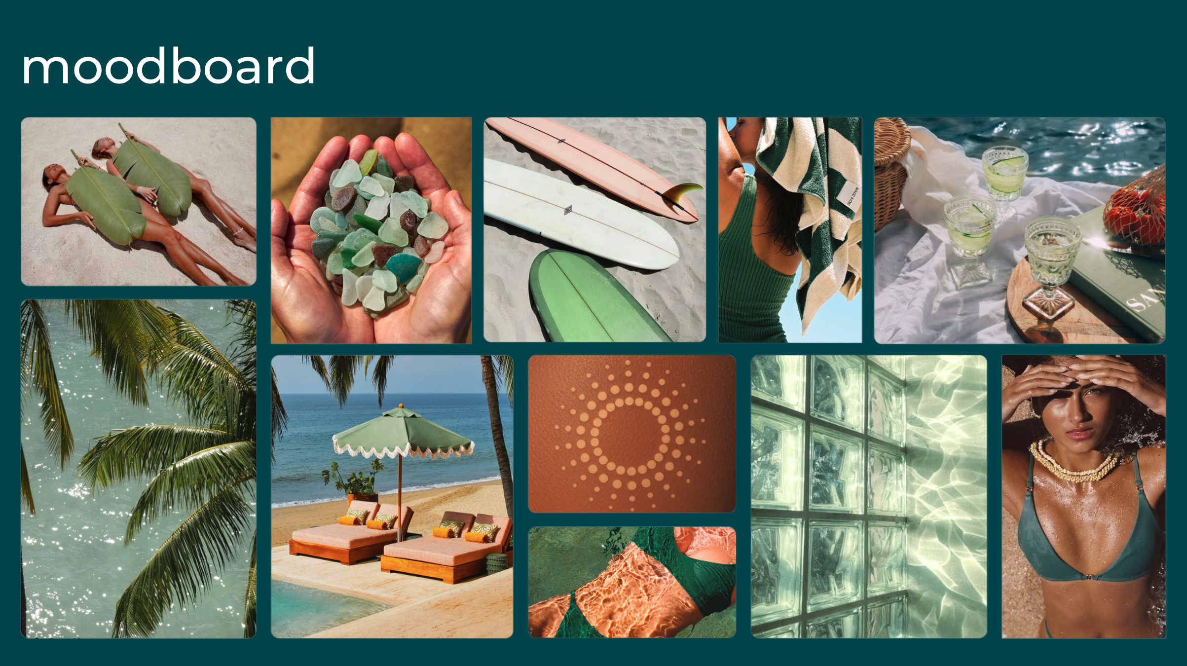
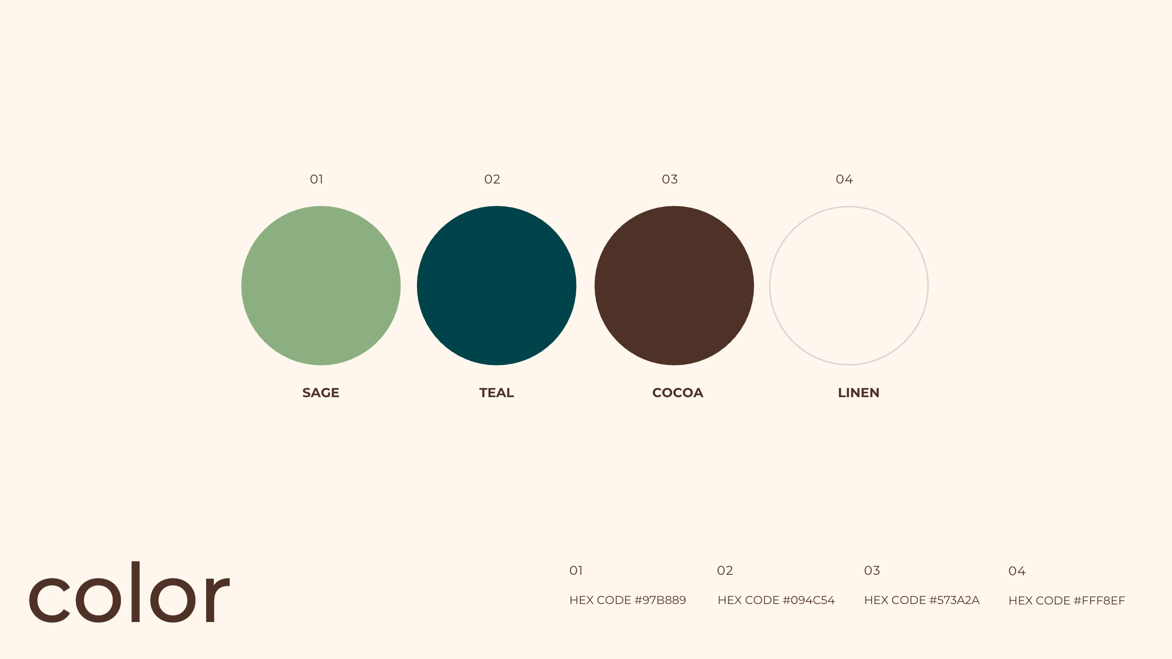
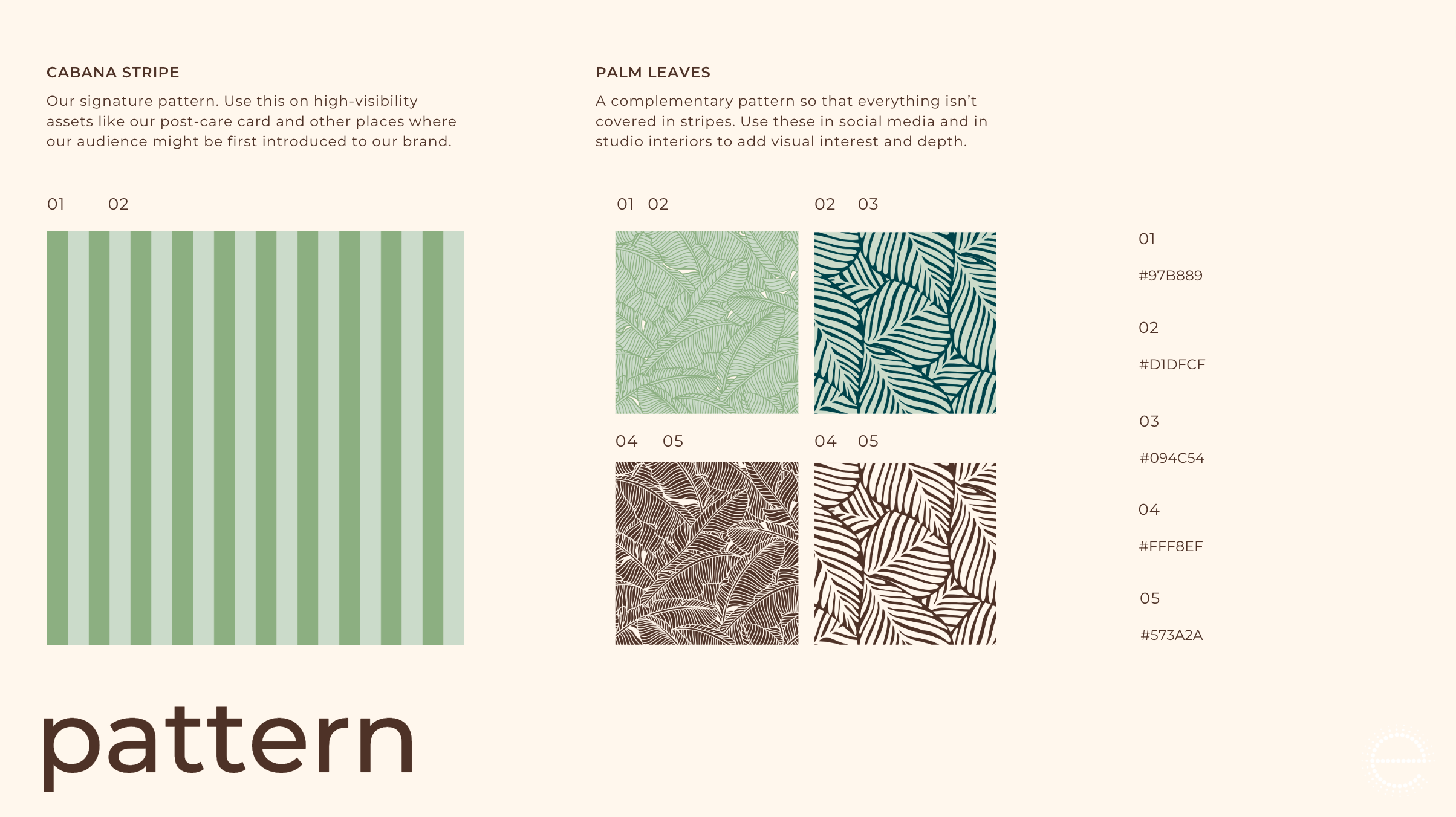
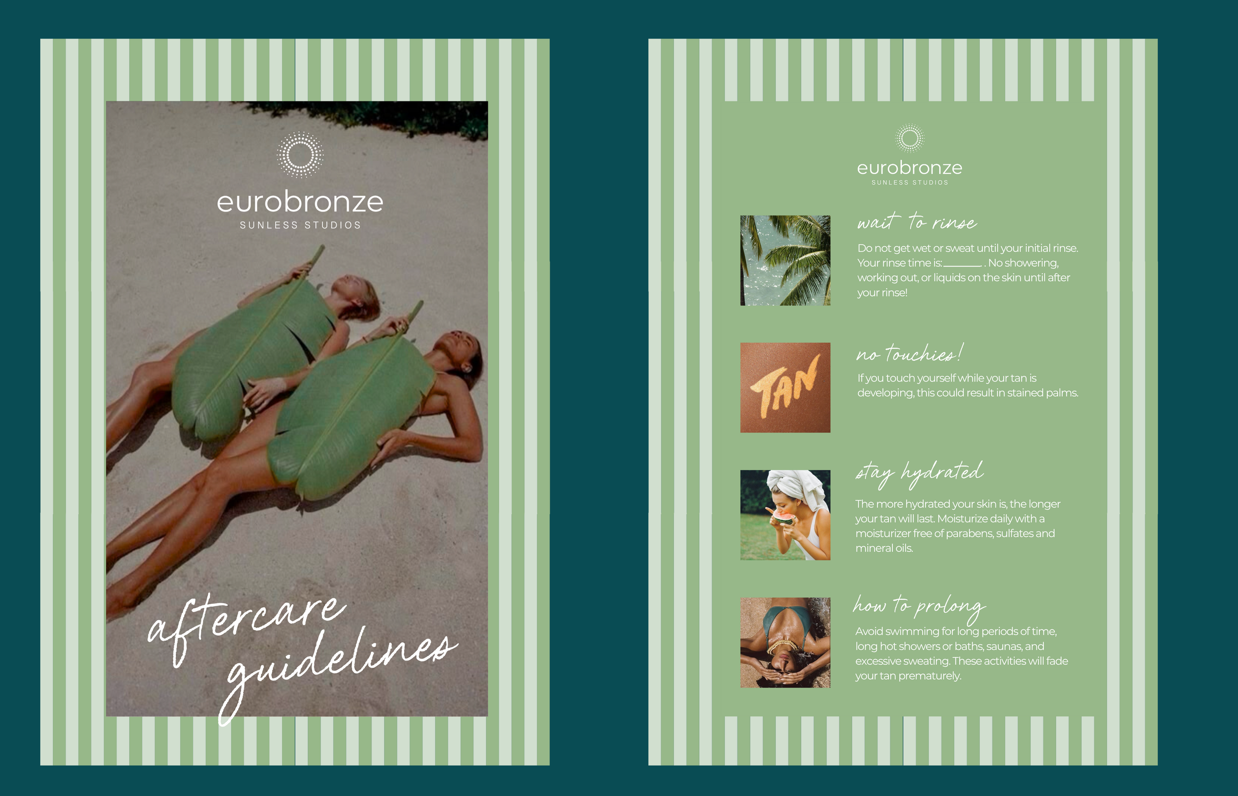
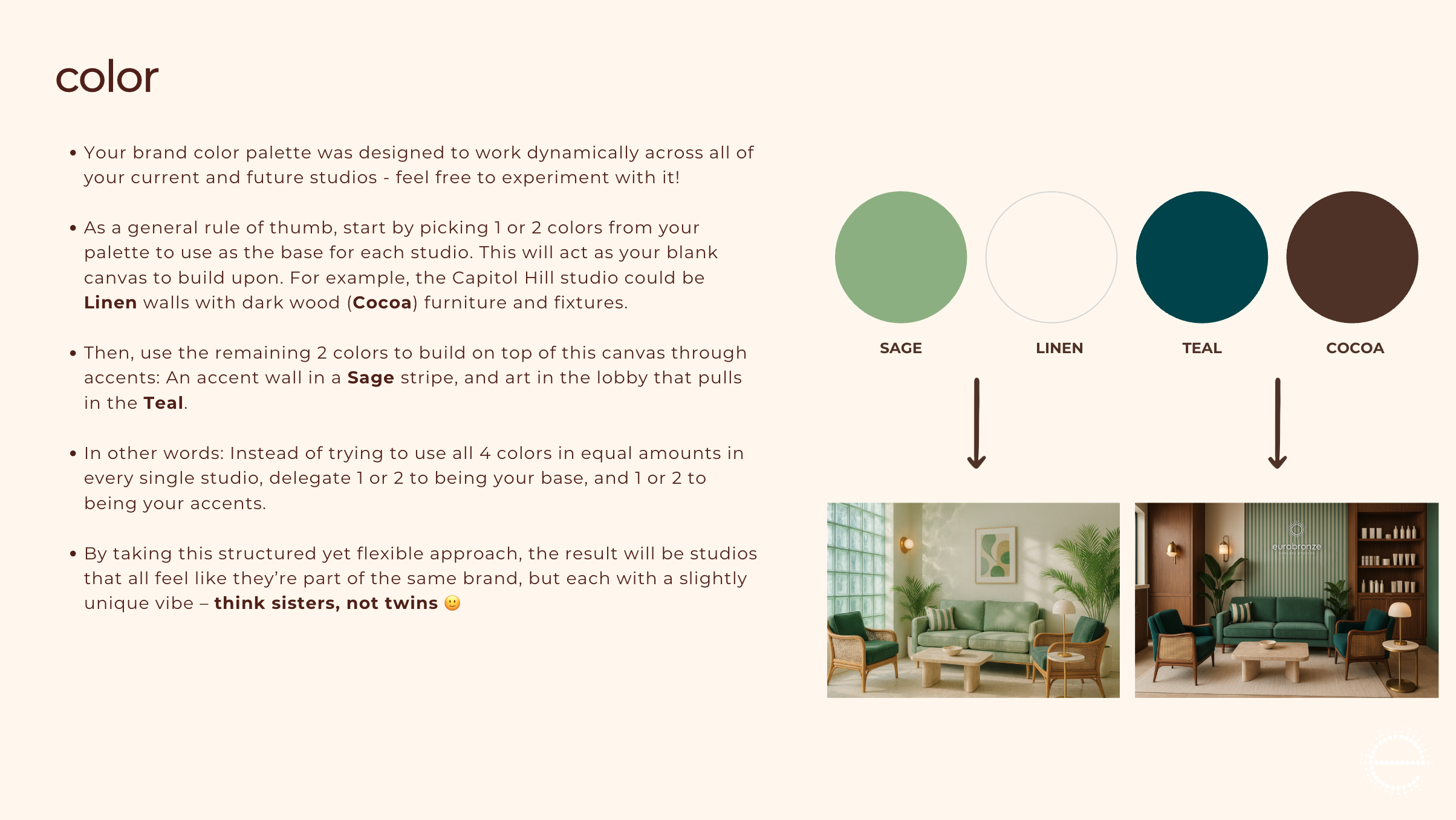
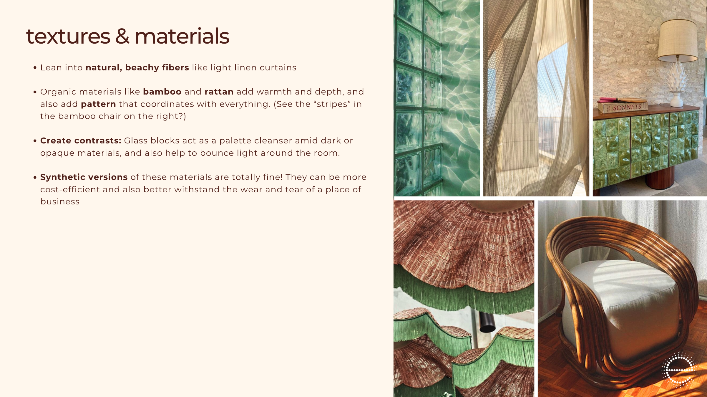
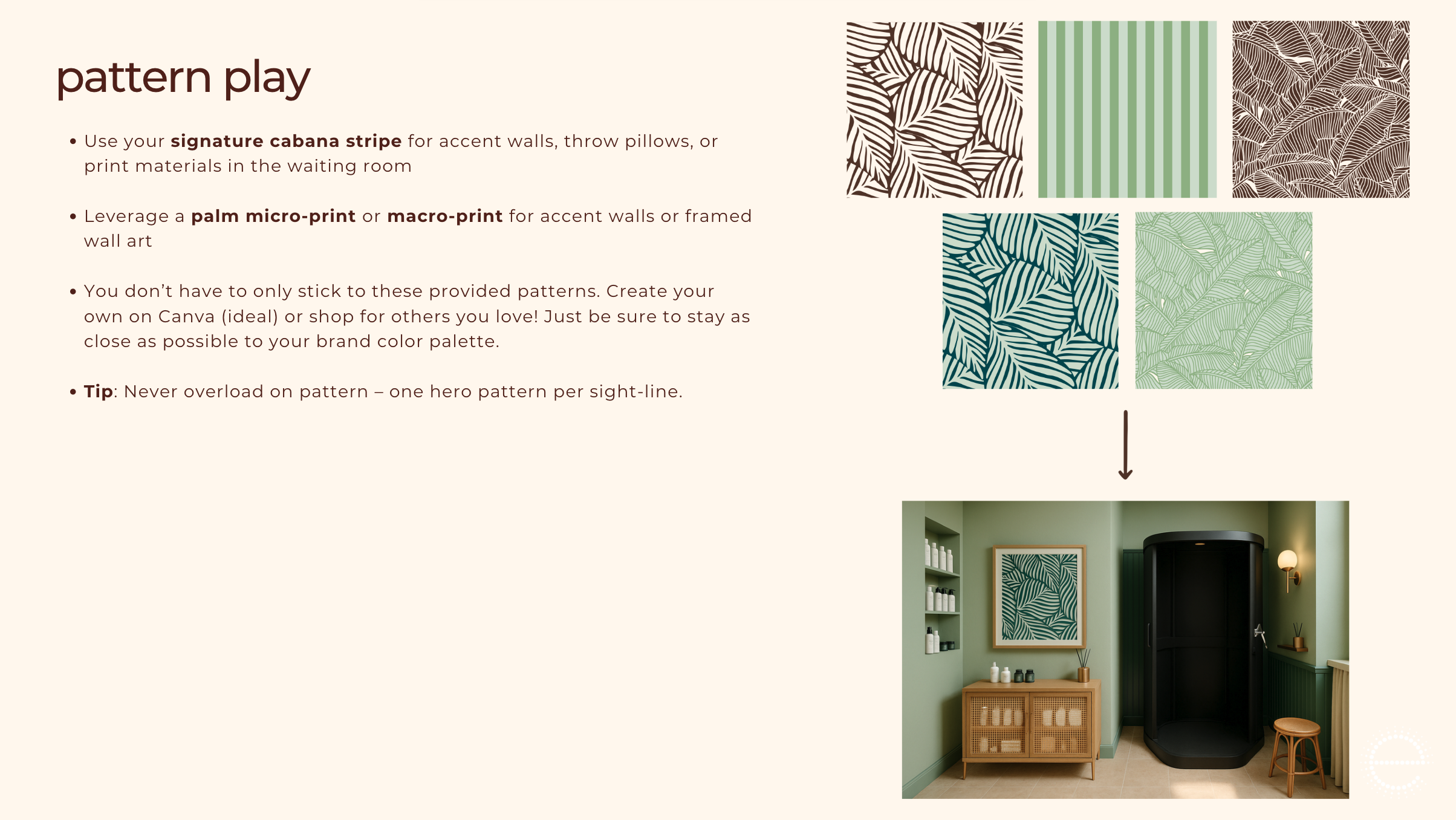
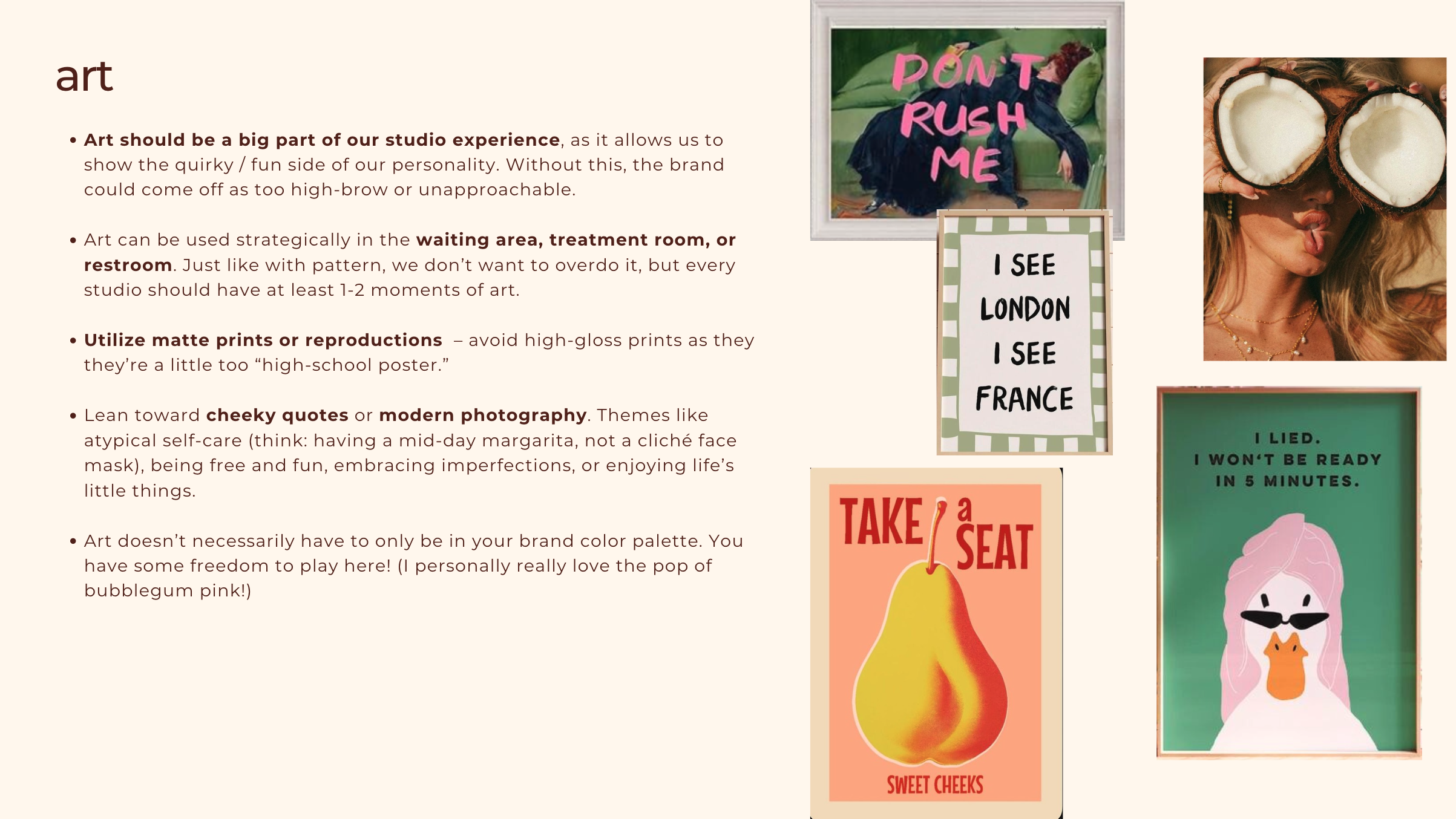
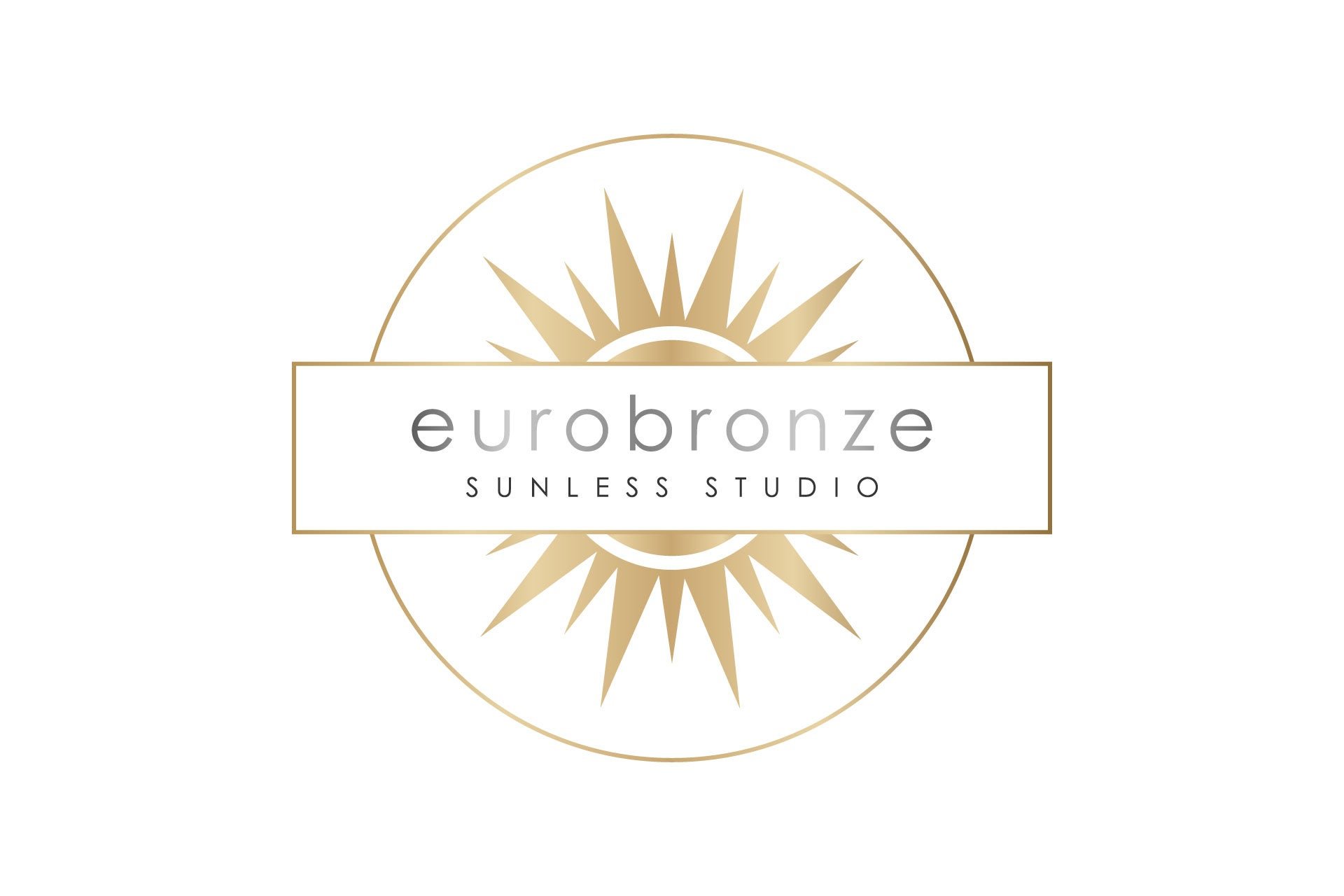
Bridget developed a warm, color-saturated system inspired by modern coastal destinations: deep teal, soft sage, cocoa brown, and warm linen, paired with cabana stripes, palm patterns, natural textures, and playful moments of personality. The outdated metallic sunburst logomark was reimagined as a “spray” sunburst (affectionately known as the EuroBronze sunspray), which retained available equity from the existing logo while creating a more flexible system for digital, retail, signage, uniforms, merchandise, and the physical studios.
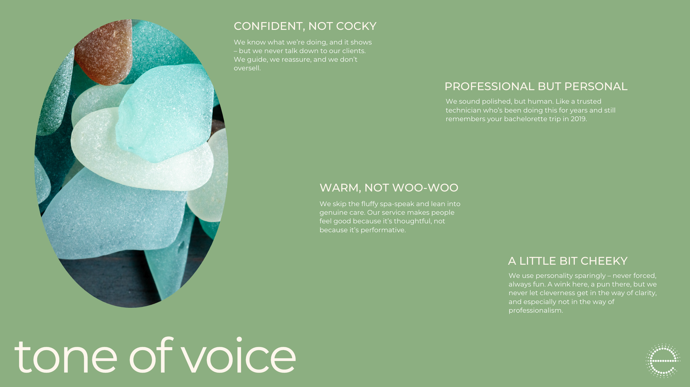
The voice followed the same philosophy: confident but never cocky, polished but personal, warm without drifting into “woo-woo” wellness language, and occasionally cheeky without allowing cleverness to get in the way of clarity.
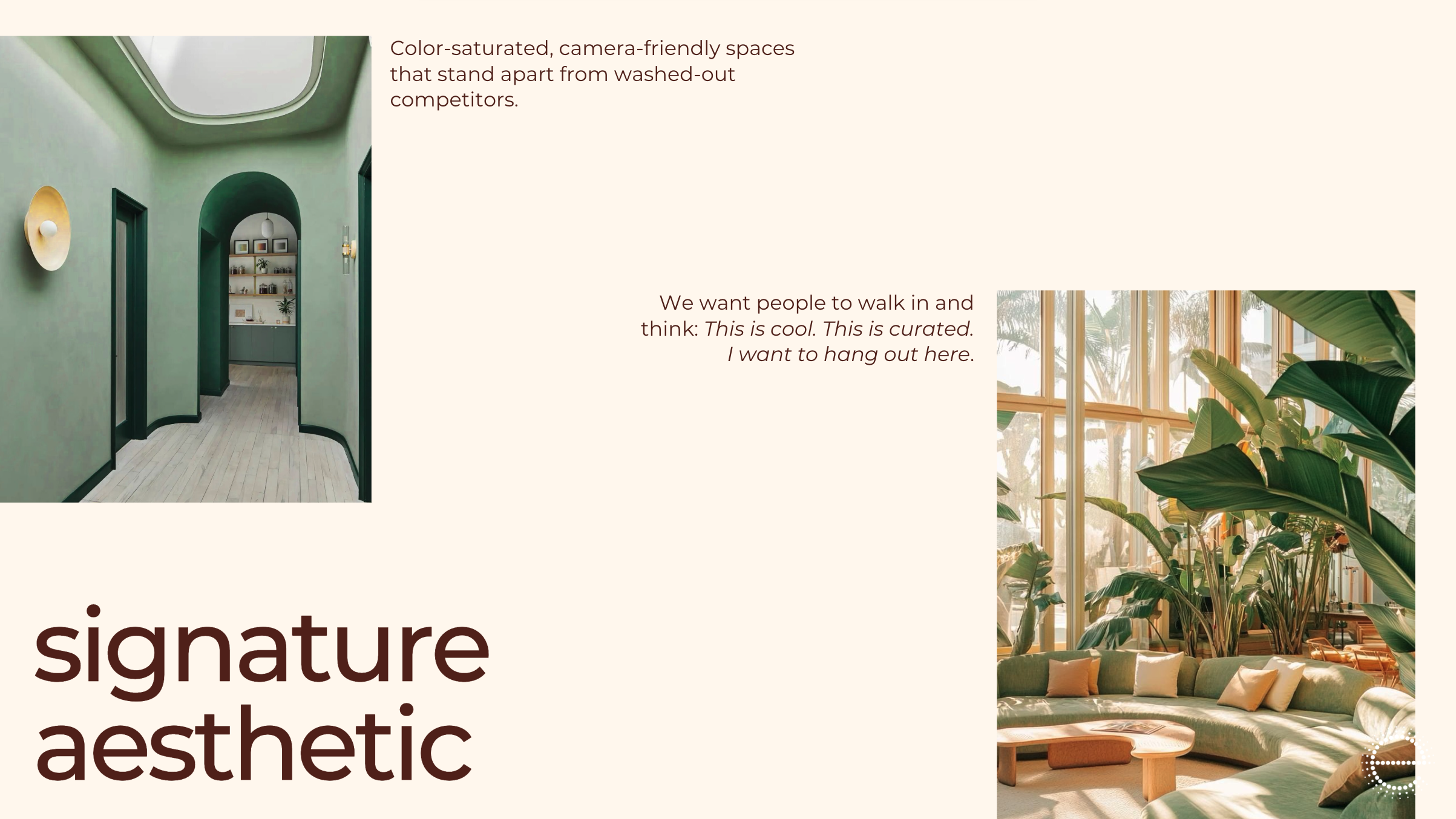
The goal was for clients to walk into a EuroBronze studio and think: This is cool. This is curated. I want to hang out here.
Beyond the Visual Identity
Because a brand is ultimately the experience people have with a business, the work extended well beyond the aesthetic system.
Bridget redesigned the ideal client journey from booking through aftercare, including recommendations for a simpler online booking flow, clearer service architecture, first-timer communications, rinse reminders, follow-up messaging, staff scripts, studio wayfinding, and a more consistent consultation and checkout experience.
She also developed concepts to support retention and revenue growth, including occasion-based service packages, a structured retail journey organized around Prep → Tan → Extend, the EuroBronze Airbrush Academy, and Club Soleil, a loyalty program designed to reward engagement while making clients feel like recognized regulars.
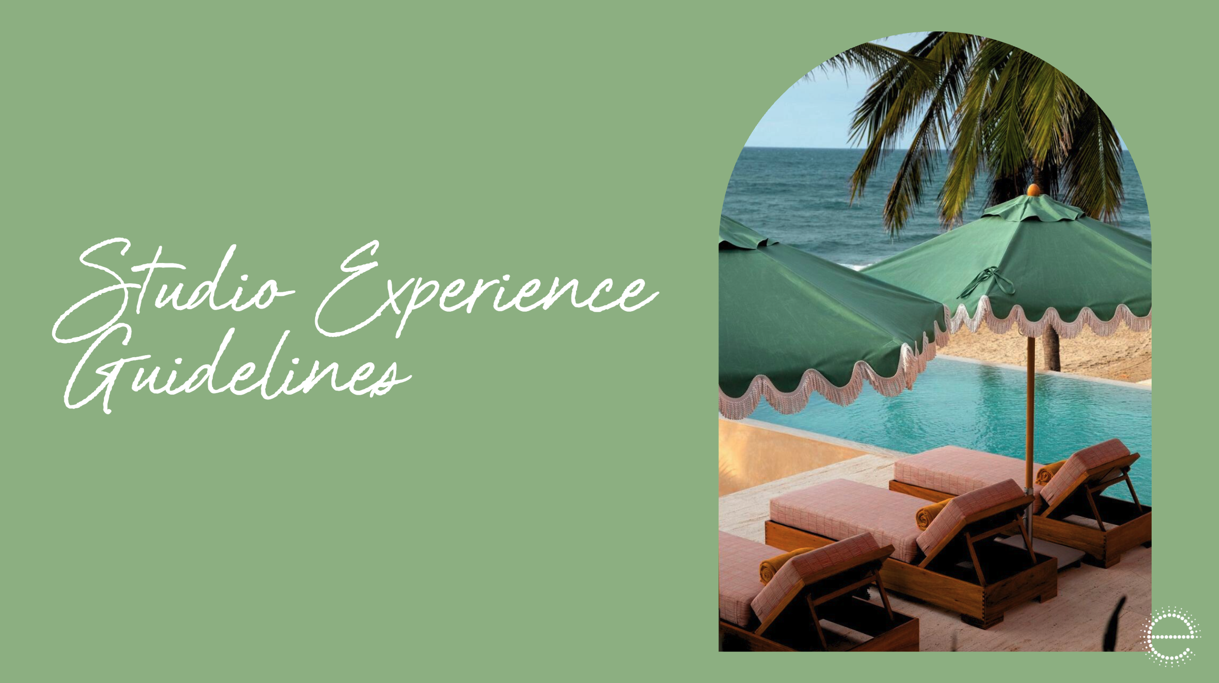
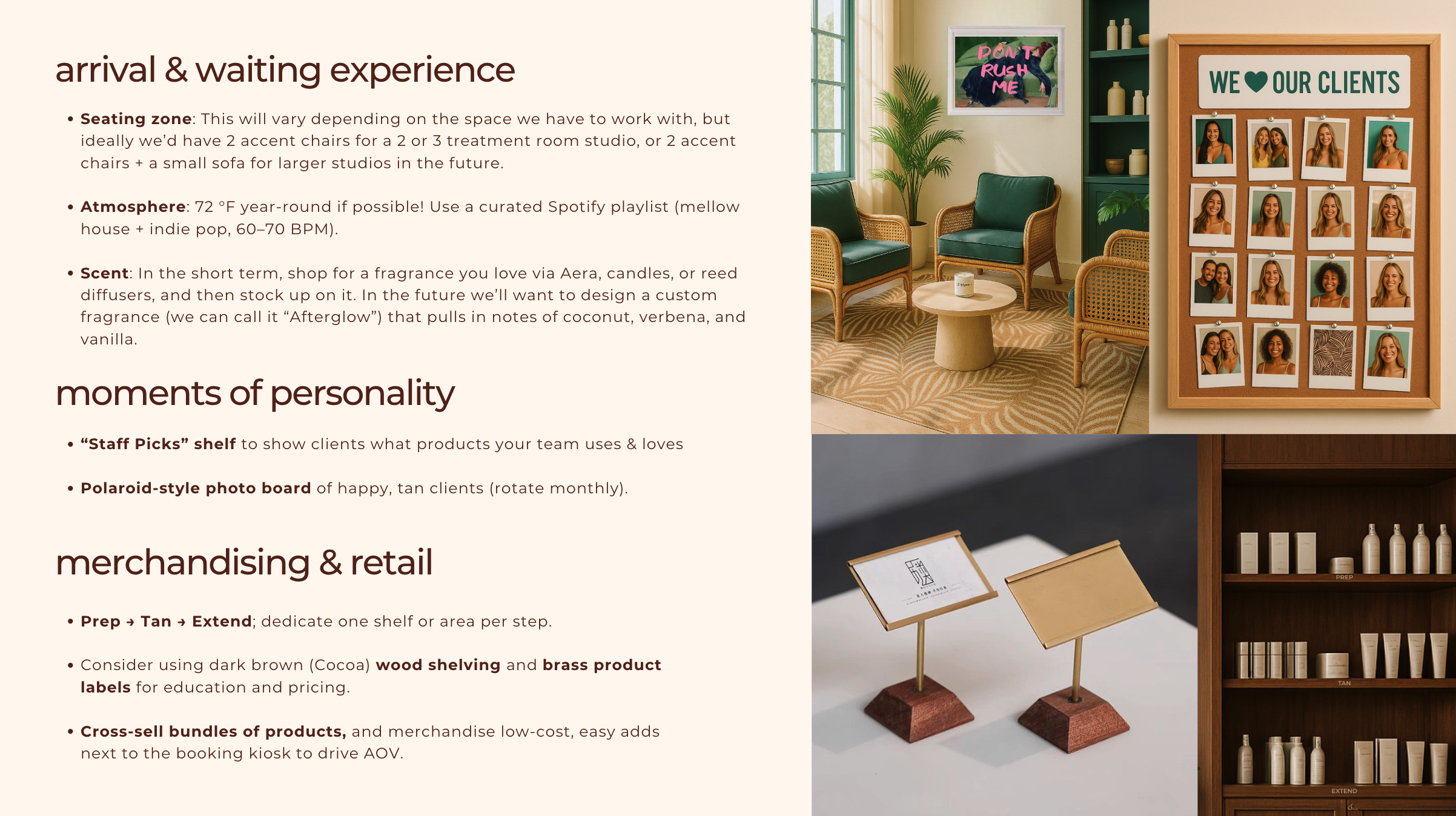
Studio experience guidelines translated the brand into physical space through recommendations for furniture, materials, art, scent, music, merchandising, uniforms, signature patterns, and scalable design principles. Rather than making every future location identical, the system allows each studio to have its own personality while still feeling unmistakably EuroBronze—sisters, not twins.
The Result
The completed rebrand gives EuroBronze far more than a refreshed look. It provides a strategic and operational foundation for the company’s next stage of growth.
The new brand reflects what clients already valued most: expertise, personalization, consistency, and genuine care. It also gives the team a clear system for improving the digital experience, aligning multiple locations, training staff, increasing retention, expanding retail revenue, and opening future studios without diluting what made the business special in the first place.
EuroBronze is no longer positioned as simply another upscale tanning studio. It now owns a more distinctive space: The seasoned expert that delivers serious results in a place where everyone feels welcome.
Outdated “Luxury” Brand
New Modern Brand